The start of the Premier League season is just one week away! To get ourselves in the mood for the big return, we rate and slate the new team kits. We start with the worst five.
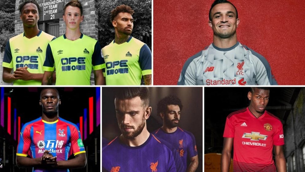
5. Manchester United home
Manchester United’s new home shirt is quite different to anything we have ever seen them don. The extra black might have actually looked good had it been reserved for just the three Adidas signature shoulder stripes. The excessive hue of it at the bottom, though, gives the shirt a rather unappealing look.
4. Liverpool away
Liverpool are known to have a knack for drab away shirts, and they seem to have lived up to their reputation once again this season.
Their mainly plain purple attempt is not so much ugly as it is uninspiring; a black version of the same design might not have been too shabby.
3. Crystal Palace home
There seems to be too much happening in very little space with the new Crystal Palace home shirt. Up to six colours, the club, manufacturer’s and sponsor logos as well as the sponsor name in two languages – it was going to take a designing genius to make it work.
2. Liverpool third
Didn’t you just know it? The Reds’ away shirts are quite a shame, given they have done quite a good job with their home strip.
The less said about this grey shirt and its garish pattern, the better.
1. Huddersfield third
Just how much effort went into designing Huddersfield’s alternative shirt? The plain, luminous-ish yellow is rather unattractive on its own, but the shirt is totally undone by the superimposed logo, layered to create a multi-dimensional effect that looks as though it was done by a primary school child.
The Premier League campaign kicks off with United hosting Leicester City at Old Trafford next Friday. Click here to start placing your bets for the new season.
